Checkout Redesign
Under Armour
The Why
The checkout process is the user's final decision point before completing a transaction. It is crucial to evaluate the checkout screen and optimize it according to the users' needs, expectations, and behavior.
Scope
Primary + secondary + tertiary level screens
Usability enhancements
Design element enhancements
Go-Live Date
iOS // 06.17.24
Android // 07.08.24
Revenue Opportunity
$795k
KPIs
⬆️ Checkout Conversion Rate
⬆️ Average Order Value
⬇️ Checkout Exit Rate
New Customer Flow
iOS
Returning Customer Flow
Android
New Customer: Main Checkout
Before

After

-
Redesigned the Main Checkout Screen to prioritize essential information for users' purchase decisions while minimizing unnecessary details on secondary screens
Order Summary section shows thumbnails of products in a customer's bag. If there 4+ items, the third thumbnail will show the amount of remaining items
Clearer section titles
Highlight sections that need user input in red text
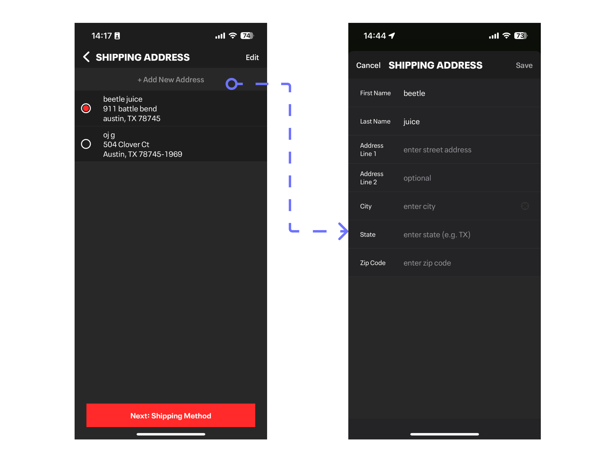
New Customer: Delivery
Before
After
-
Reduced the steps in takes to enter first address
Updated address input form UI
Added required field indicator with inline error messaging
Added address autocomplete functionality (iOS)
De-emphasized optional address line 2
Added ‘Default Shipping’ checkbox
Updated Primary CTA (Save)
Non-linear flow
New Customer: Payment
Before
After

-
Updated UI
Payment iconography
Primary CTA (Save)
Secondary CTAs (Add New Card / Add New Address)
Contextual menu
New behavior: When user switches credit cards OR adds a new card 1) any selected address is deselected 2) display ‘Select or add a billing address’ message
Non-linear flow
Returning Customer: Main Checkout
Before

After

-
Redesigned the Main Checkout Screen to prioritize essential information for users' purchase decisions while minimizing unnecessary details on secondary screens
Order Summary section shows thumbnails of products in a customer's bag. If there 4+ items, the third thumbnail will show the amount of remaining items
Display “FREE” shipping messaging
Clearer section titles
Added payment iconography
Returning Customer: Delivery
Before
After

-
Updated UI
Address input form
Primary CTA (Save)
Secondary CTA (Add New Address)
Added required field indicator with inline error messaging
Added address autocomplete functionality (iOS)
Added ‘Default Shipping’ checkbox
Non-linear flow
Shipping Method
Before

After

-
Updated UI
Font size
Primary CTA (Save)
Non-linear flow
Order Summary
Before

After

-
Order Summary opens in a modal/sheet view and allows users to review order details and quickly glance at what products are in their order without the need to go back to Bag screen
Promo Code
Before
After
-
Updated UI
Promo icon
Text field
Added messaging to empty state
Added contextual menu to applied promos
ID.me
Before

After

-
Updated UI
Increased text size
Increased size of Verify with ID.me button
Gift Cards
Before
After
-
Updated UI
Mask/unmask eye icon
Text field
Gift card icon
Contextual menu
New mask/unmask security requirements
Gift Message
Before

After

-
Updated UI
Text field
Gift icon
Push to full screen
Order Confirmation
Before

After

-
Updated UI
Hero image
Section hierarchy
Product card
Primary CTA (Continue Shopping)
Personalized message: “Thank you, [Name]”